21638 In-game now on Steam


Building a Better Apocalypse
March 25, 2009 - Chet Faliszek
We recently updated the PC version of Left 4 Dead with some exploit fixes and Versus balancing. We are going to be releasing another small update later today that contains some server issue fixes and one small, but very large, gameplay adjustment. We have made a change to the melee mechanic in Versus and the soon-to-be-released Survival Mode.
Xbox 360 users will see these same gameplay changes in an update coming out with the DLC — which, in case you missed the announcement, will be coming out April 21st.
As we continue to work on Left 4 Dead, our plan is to release more frequently on the PC, and then group those updates for the 360.
With the upcoming release of the SDK, and the community servers already available on the PC, matchmaking is one place where the two platforms will diverge. A future blog post will detail our roadmap for PC matchmaking.
Game statistics help us evaluate the success of the changes we've made to the game. In Versus, for example, we flipped the order in which teams play the next round based on who was winning the round before it. We were confident this would help to better balance the game and give neither team a lasting advantage. That would, in turn, translate into more people playing through the final maps. Since making that change, we've noticed the percentage of games being played to the end jump 5%. It is a small increase, but a step in the right direction.
But statistics are only part of the picture. We also use direct feedback from players themselves. One of the questions people ask is if we read the forums: the answer is yes. So please post your feedback on the melee and other changes as we make them. We promise to keep listening to your feedback, making changes and improving the gameplay experience of Left 4 Dead. Remember: If you don't see an issue addressed with this update, that doesn't mean it isn't coming.
Game of the Year
January 8, 2009 - L4D Team
With 2008 behind us, the gaming press has once again sorted through the year's releases and made up their annual lists for Game of the Year. Find out how Left 4 Dead ranks with IGN, GameSpot, GameSpy, 1UP, Onion AV Club, Destructoid, Kotaku, Team XBOX and more by clicking here.
L4D Art Direction, Part 2: Stylized Darkness
January 2, 2009 - Randy Lundeen
Aesthetics, fiction and gameplay: these are three criteria that we always consider when employing a new art direction for a game. With a game as dark as Left 4 Dead, this meant having to figure out a lot of new ways to use the absence of light to our advantage.
Here's a sample screenshot from an early version of the game.
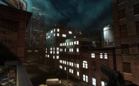
From an aesthetic standpoint, this is the wrong atmosphere for a horror game. It's too bright. From a narrative standpoint, it detracts from the fiction we're trying to create: if the player's in the midst of a zombie apocalypse, how come everything looks so unaffected by it? Why do all the buildings still look occupied?
Most importantly, though, this screenshot fails from a gameplay standpoint. There are too many light sources to give the player any useful navigational clues. In other words: it's not telling you where you should be heading. Let's look at the same screenshot with simplified lighting:
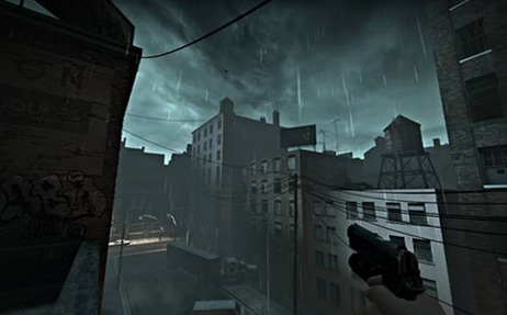
From watching many playtests, we found players instinctively moved towards well-lit areas. Simplifying the lighting helped the gameplay (the player is drawn to the warm glow down the street, and not distracted by unnecessary light sources); the fiction (this entire city block's been abandoned—something's not right here); and the aesthetics (by simplifying the visual information, we've given a focal point for the eye to follow).
Getting Inventive With Lighting
Left 4 Dead's setting is a post-apocalyptic wasteland just before nightfall. As mentioned earlier, this meant constraints in terms of the light sources we could use without hurting the gameplay, fiction or aesthetics. This forced us to get creative: what lighting would you realistically see in an abandoned city overrun by zombies?
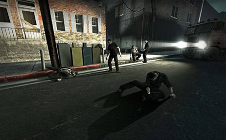
Car headlights are a perfect example. They tell a good visual story, implying a sense of abandonment. When you see a car with its headlights on and nobody around, it's clear something's gone wrong:
Make that an abandoned police car, and it's clear something's gone very wrong:
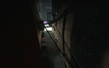
On the aesthetic side, car headlights are a low light source. This was a big plus, since it meant a lot of long, dramatic shadows. To help gameplay, we placed the cars at intersections where we wanted to direct players or lead them around obstacles.
Silhouettes
Designing Team Fortress 2 taught us a lot about how important silhouettes are. Clear character silhouettes helped players get distinct reads in an instant, giving them the information they needed to make important snap decisions in a fast-paced environment.
But while TF2 had a bright and colorful art direction, Left 4 Dead takes place in a variety of dimly lit nighttime environments. Because of this, playtesters weren't able to see zombie silhouettes in the midground and background. Because of this, they were repeatedly getting mobbed.
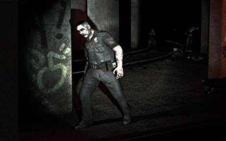
While sudden zombie attacks were inarguably scary, they were also frustrating—players weren't being given the information they needed to react. They wanted that "Here they come!" moment, and we weren't giving it to them. The solution? Light-colored fog:
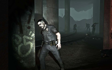
While not as realistic-looking as actual fog in some settings, it meant playtesters could see attackers in the distance. Once they were able to anticipate attacks, playtesters started to have a much better time.
The Player as Light Source
Flashlights, like car headlights, were a great way to light the game without contradicting the game's fiction. Even better, we found that by making the flashlight weapon-mounted, the light is just slightly off-center at all times. This created interesting shadows and helped make zombie attacks much more dramatic. From a gameplay standpoint, gun-mounted light sources also had the interesting side effect of disappearing when you reloaded or shoved zombies back.
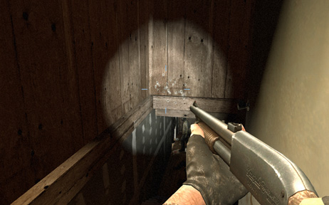
This gave both actions a sense of consequence, and encouraged players to stick close together because they didn't want to be left alone in the dark when reloading.
Self-Shadowed Normal Mapping
Normal mapping is a graphics technique that lets game developers create the appearance of detail on surfaces without additional geometry. Normal mapping could, for example, make a brick wall appear to have depth without having to use a lot of geometry at the sake of performance.
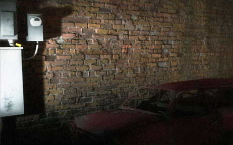
Self-shadowed normal mapping takes this technique to the next level. Not only do the bricks look bumpy-they also cast shadows upon themselves, creating a better sense of realism. Using self-shadowed normal mapping had a dual benefit: It really helped the visuals pop in a game dominated by flashlights and darkness; and, after doing the code work, didn't end up sacrificing any more performance than regular normal mapping.
Specular Surfaces (Wetness)
One final technique that we used in Left 4 Dead was the use of Specular Surfaces, or wetness. In horror movies, you'll find dark settings are almost always wet. Wet surfaces create highlights, they create parallax-they create an atmosphere.
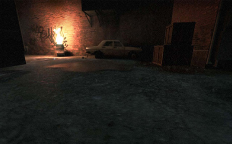
Specular Surfaces worked great with our Self-Shadowed Normal Mapping technique. Wet surfaces imply more detail. Even in a shadowed area, the glint off a wet brick wall implies a greater amount of detail on a surface that would otherwise look blank. Aesthetically, this made environments feel that much more bleak and miserable. Narratively, they implied how decrepit these abandoned areas had become. Wetness also helped gameplay, as a way of counteracting the darkness. In many cases, having a wet surface behind a zombie helped pop its silhouette, just as if it had been standing in front of fog.
We hope you enjoyed this brief look at the thought process behind the art direction in our games, and the importance of playtesting in our decision-making process.
Don't forget to read part one here!
The Moviemaking Process: Left 4 Dead's Intro Movie
December 4, 2008 - Jason Mitchell
Because Left 4 Dead is a new property for us, we wanted to provide some basic player training prior to the start of the game. Traditional in-game training mechanics didn't make sense for Left 4 Dead, because they would take away from the sense that players had been immediately dropped into a very real, very dire zombie apocalypse. We didn't want a slow ramp-up in gameplay to take away from that tension. As a result, we decided that it would make sense to begin the game experience with a non-interactive introductory movie that could get players revved up and subtly cue them to important gameplay mechanics such as "light disturbs the witch" and "car alarms attract the horde."
Starting a game with a movie was a new approach for us, but luckily we have built up some moviemaking expertise in the past few years with the Team Fortress 2 shorts. In this blog entry, we'd like to share with you some insight into the process that led to the intro movie that shipped with Left 4 Dead. To do this, we will show four different versions of the first half of the movie from various stages of production.
In order to evaluate projects as we go along, our filmmaking team prototypes and tests our movies on external test audiences, just like the gameplay teams. We began making animatics in mid summer as we started fleshing out the story and pacing of the piece, bringing in external test audiences to view the movie and provide feedback.
Animatics and Filmmaking
If you're new to the world of filmmaking, it can be a bit disorienting to try and concentrate on the primary goals of an animatic because the animation is intentionally very basic, the rendering is often crude and the dialog frequently consists of placeholder lines recorded quickly by an artist or writer working on the piece. It is important to understand that the purpose of an animatic is to define the timing of the dialog, story beats, edits, camera angles etc in order to quickly flesh out a story that works in a broad sense. This way, we can try out different ideas and can make large improvements in story quality in a short period of time at low cost. In the early phases of development, we are not concentrating on animation, lighting or rendering quality.
8 July 2008
What you see below is the first half of the very first animatic we created for the Left 4 Dead intro movie back in early July.
If you wish to watch this video, you will need to Download the Flash plugin.
As you can see, we were still using the old character models for Francis, Zoey and Bill. In fact, one of the reasons that the Survivor models were redesigned was that the original meshes did not hold up well under the demands of the facial animation that was required for both the game and the intro movie. Over the course of the next couple of weeks of refining the story, we found that the romantic tension between Zoey and Francis that you see in this version did not playtest well, as it proved to be a distraction from the gravity of the Survivors' desperate situation. As a result, this was dropped from subsequent versions. Later in the piece, when the hunter pounces on Louis, the timing of Louis's line and the hunter's pounce consistently came off as comedic, which was certainly not the intended effect.
25 July 2008
In this next version, completed two and a half weeks after the initial animatic, you can see that we had addressed some of the above concerns:
If you wish to watch this video, you will need to Download the Flash plugin.
As you can see, with the exception of Zoey's head texture, we have the new character models integrated into the movie. The animation and editing is starting to tighten up, including many camera angles that would survive unchanged all the way to the final edit. Even some of the dramatic lighting is starting to be put in place.
Despite this progress, there were still several areas that needed to be addressed. The infected saying "nyuh?" before the grenade exploded was distractingly humorous and was cut. The emotional beat between the grenade explosion and the arrival of the helicopter was breaking the otherwise quickening pace of the piece and so it was cut. Although this was painful because it removed an opportunity to further flesh out the characters, we felt it was the right move to cut this moment to keep the pace up.
Additionally, the hunter pounce on Louis still played as comedic and needed more tension to be as horrific as intended. Through playtesting, we also found that the initial sections of the hunter sequence were lingering a bit too long, allowing viewers to wonder whether Louis would himself become infected. In later edits, this part of the intro would be edited more tightly and shot with more close-ups in order to remove any lulls in which the viewers would be tempted to ponder the fate of Louis themselves. You also notice that the hunter no longer gets away from the survivors but instead falls from the building and sets off the car alarm, providing a plausible cause for the Survivors setting off the alarm.
4 September 2008
The version below is from September 4th, just one month before we had to deliver the movie for the final XBox 360 disc. The music was starting to come together and body animation was nearing final quality on some shots.
If you wish to watch this video, you will need to Download the Flash plugin.
As you can see, some basic facial animation was added to convey a sense of emotion, though most of the lip synch was still being put off until we had committed to final dialog.
The hunter's pounce of Louis was made into a scary moment by building anticipation through the hunter point-of-view, culminating in the hunter's scream as he pounced. This moment no longer got laughs and was actually cited by some viewers as the scariest part of the piece, which reassured us that we had fixed this long-standing problem.
You'll also notice that we had created an additional beat in Zoey's confrontation with the hunter as she ran out of ammunition and Louis had to shoot the hunter before it turned to attack Zoey. The subsequent fleeing of the hunter up the building and the fall down on to the car was eventually cut for a tighter one shot kill from Louis onto the back of an alarmed car.
In subsequent versions, we cut Zoey's running out of ammunition, as this made her appear weak, which we wanted to avoid. As you'll see in the final version, her rapid-fire double pistol attack on the hunter is much stronger, which was more in line with the feeling we wanted to convey.
Final Version - 4 October 2008
Although the Left 4 Dead ship date wasn't until the 18th of November, we had to deliver the movie for the XBox 360 game disc on the 4th of October, including localized and lip-synched versions in five languages and a low-violence version for the German market. Below, you can see the complete movie that shipped with Left 4 Dead, or you can watch the High Definition 720p version on Steam.
If you wish to watch this video, you will need to Download the Flash plugin.
Final Thoughts
The four minute Left 4 Dead intro movie evolved from animatic to final product over the course of about 3 and a half months and we were extremely pleased with the result. We managed to meet our goals of subtly teaching players about important gameplay elements while building excitement in the lead-up to the rooftop starting point of the initial "No Mercy" campaign.
Play Left 4 Dead with Valve
November 20, 2008 - L4D Team
Join Left 4 Dead's developers for a few campaigns against the zombie horde this Saturday, November 22 at 9:00 pm (EST). All you have to do is send off a game invite to one of the gamertags listed below. See you there!
Scott Dalton
Charlie Burgin
Chet Faliszek
Jason Mitchell
Matt Scott
Adrian Finol
Kerry Davis
Kim Swift
Brian Jacobson
John Morello
Gautam Babbar
Elan Ruskin
Left4Dead Dev 1
Left4Dead Dev 2
Left4Dead Dev 3
Left4Dead Dev 4
Left4Dead Dev 5
Left4Dead Dev 6
Left4Dead Dev 7
Left4Dead Dev 8
Left4Dead Dev 9
Left4Dead Dev 10
Left4Dead Dev 11
Left4Dead Dev 12
Visit Microsoft's Game with Developers event for more details.


